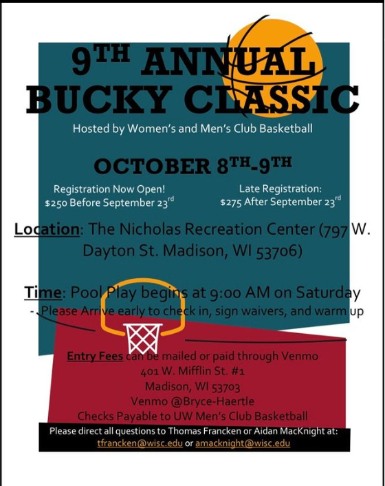
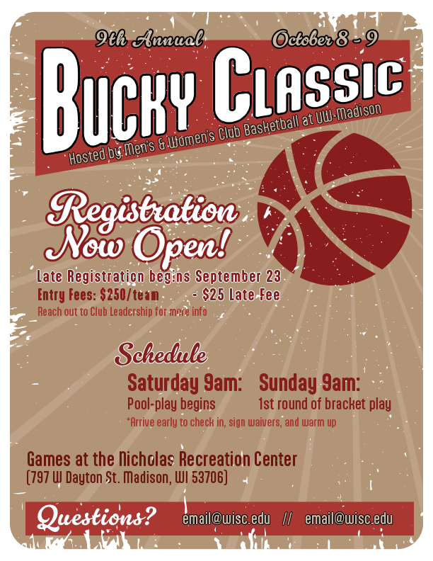
This Redesign project was done during LSC 332 - Print & Electronic Media Design. The goal of the project was to find and identify a “problematic” flyer to redesign. The flyer on the left is the original design that was found on the instagram page of the Men’s Basketball Club. My redesign can be found on the right. I drew inspiration from old-school posters, using more muted tones, classic fonts, and added weathering to the final design.

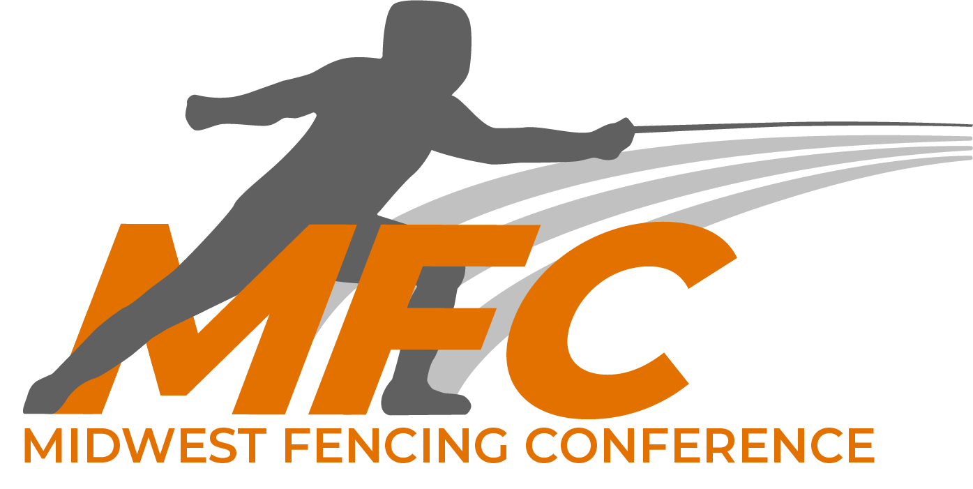
The top design is the original Midwest Fencing Conference Logo and the bottom design is the redesigned logo. This was created for a redesign contest for the conference and was open to all members in the conference. My redesign was voted on at the general body meeting and selected to be the new logo. I even won a free t-shirt!
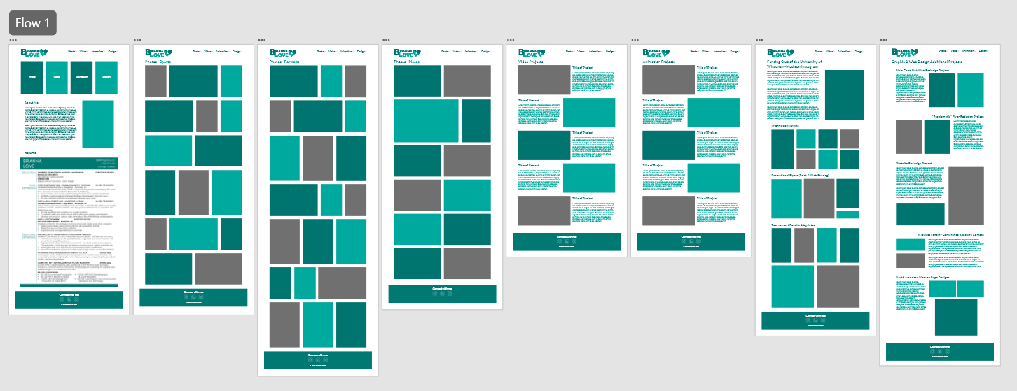
This website is hand coded by myself. I learned about web design in one of my courses, LSC 532 Web Design for the Sciences. On the right is an image of my initial prototype of the site designed in Adobe XD.
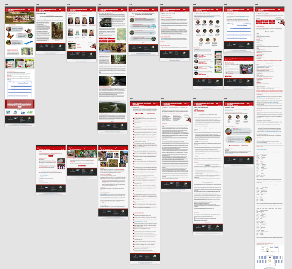
On the left is the final redesign of the Upham Woods Website. Upham Woods is a UW Extension and agreed to be the client for this project. Their current site has a lot of different information that was difficult to find and navigate, so our main goal was to improve the flow and navigation. Working with a classmate, we designed the new website in Adobe XD.
Check out the link below to navigate through the working prototype:
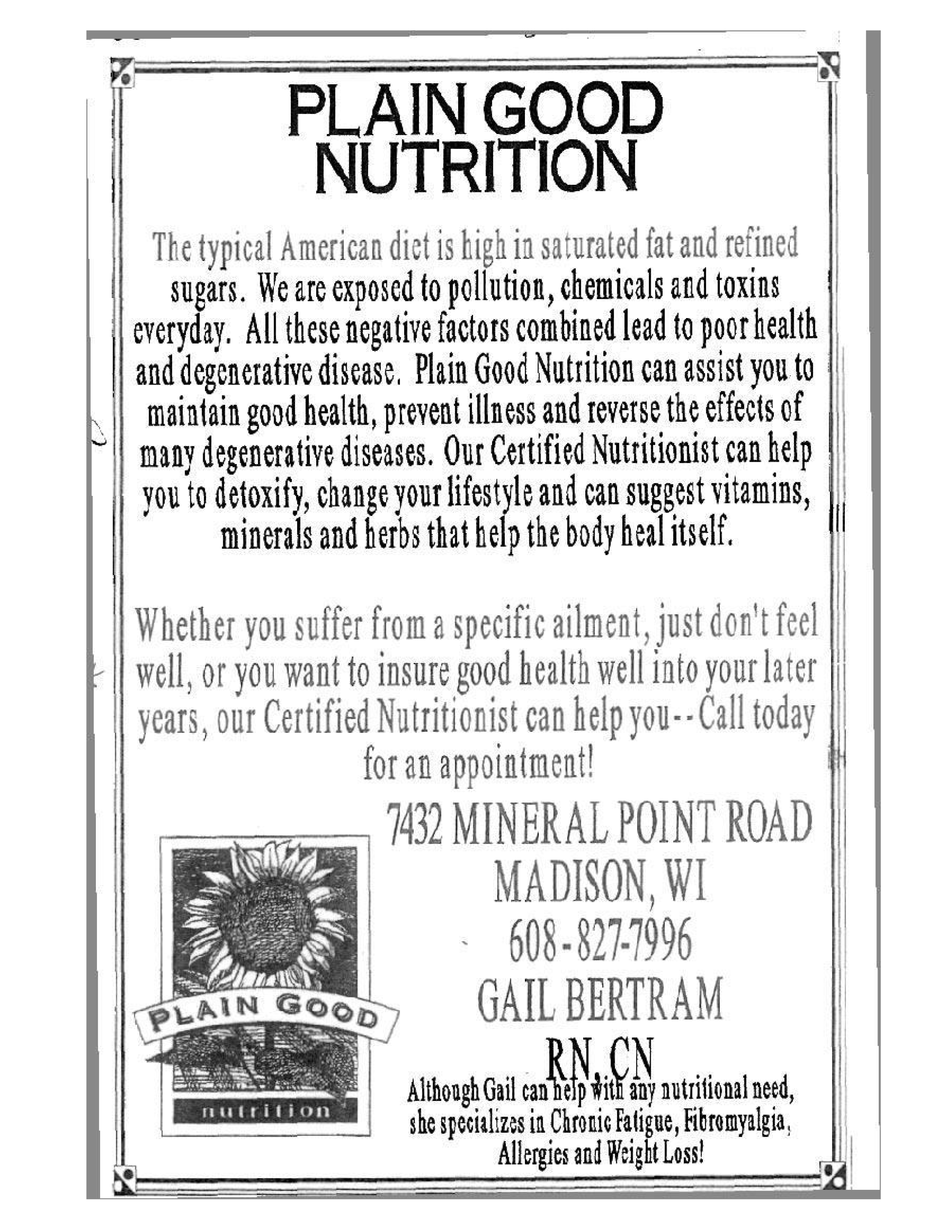
View Adobe XD PrototypeAnother redesign project a part of LSC 332 - Print & Electronic Media Design. This poster was given to us as a challenge in redesign a poster that was very text heavy. The only requirement of the assignment was that the copy could not be changed, apart from the title. I focused on the message of the flyer to be finding a specialized nutrition plan. This guided my decisions on text hierarchy and organization.

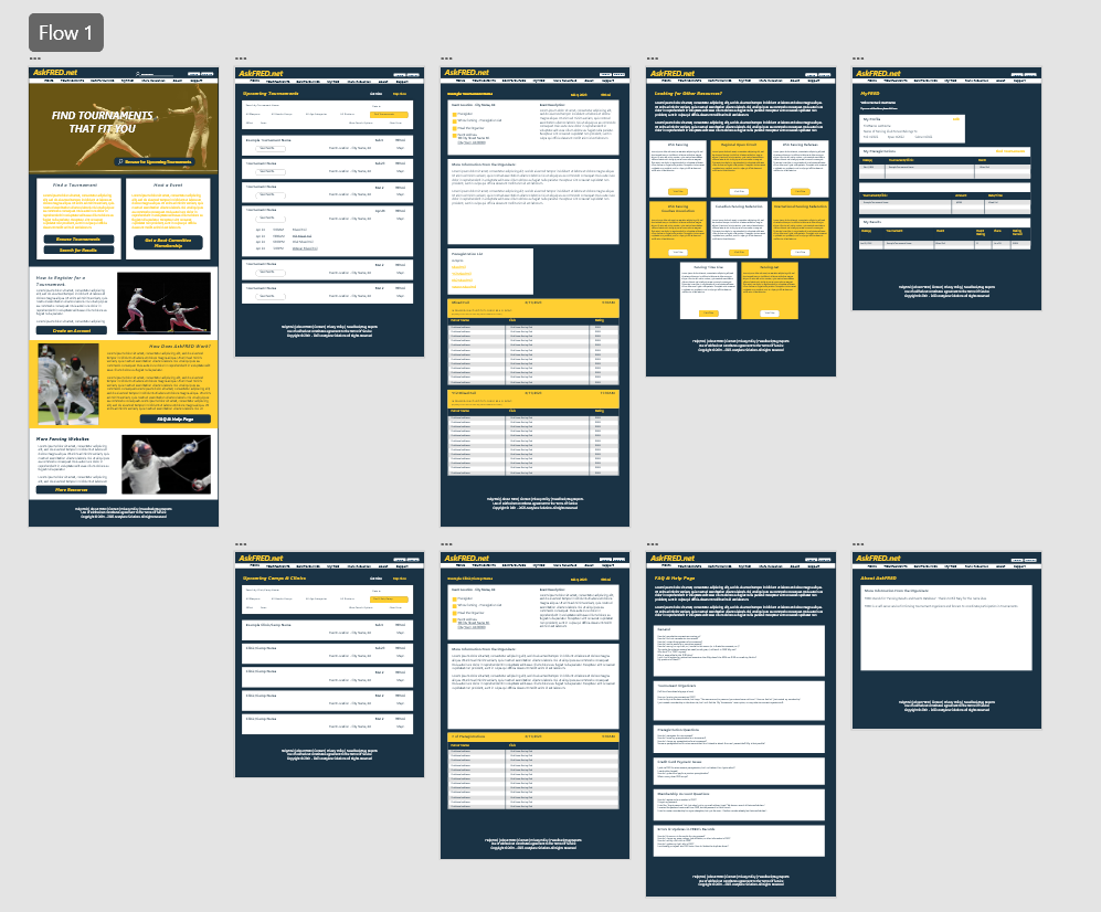
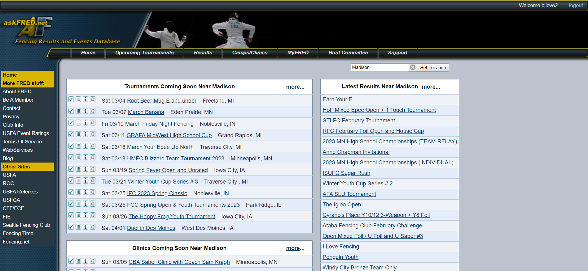
As a part of LSC 532 - Web Design for the Sciences, we were asked to find and redesign a website that related to our interests or career goals. AskFRED.net is the biggest fencing tournament hosting and registration site in the country, and had not been visually updated for about a decade. While it gets the job done, there were a lot of improvements to be made to the home page of the site. My main goal was to make the homepage more friendly to new visitors (fencers and parents), while giving the site a more modern and updated look. Outside of this class, I redesigned additional pages.
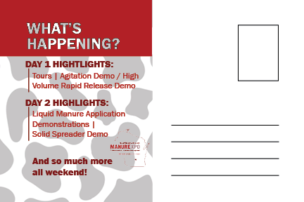
Designs created during a client project in LSC 332 - Print & Electronic Media Design. We worked with the Marketing Team from the North American Manure Expo to create designs for their upcoming event in Wisconsin. The project consisted of 3 facebook posts, a postcard for print, and 2 additional items. I worked in a group of three, specifically designing 1 facebook post, and the postcard. On the left is the front and back of the postcard, and the facebook to the right.


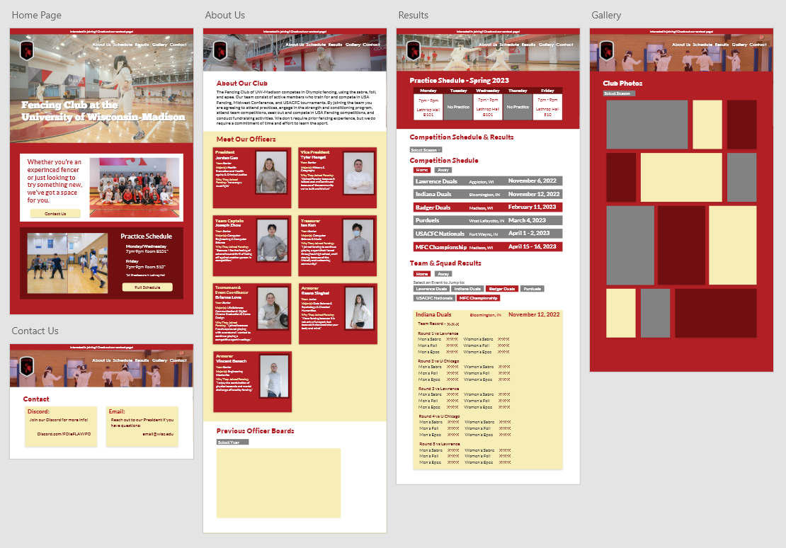
After being in the club for 4 years and being a part of the Officer Board, I gained a good understanding of the club's operations. One thing that I noticed was the crazy amount of emails the club president would get from incoming members. To eliminate the amount of repeat questions, I designed the contact page to lead viewers to the club's Discord, where interested members can ask more detailed questions to all officers or club officers.
Check out the link below to see the site
Fencing Club UW-Madison Website Coming SoonAs a fun exercise, I did a set of redesigns for the Madison Fencing Club's logo. The left most logo is the club's current logo, and to the right are the 4 potential redesigns. I also hope to redesign the club's website in the future.
